Category: Thin Films

Semiconductor thin film process data analysis and visualization

  • Logistic Regression in R for Wafer Defect Prediction

    Logistic Regression in R for Wafer Defect Prediction

    Defect data arrives as a binary outcome. A wafer passed, or it did not. Logistic regression is the workhorse model for that shape of data, and it is one of the few statistical tools whose coefficients translate directly into language a process engineer can act on, because the coefficients become odds ratios.

    This post walks through a complete logistic regression workflow in R using a simulated dataset from a deposition style process step. Every number below comes from synthetic data generated in R with a fixed seed. The results are illustrative examples of the method, not measurements from a real fab, and the whole analysis is reproducible from the code shown.

    Why a binary outcome needs its own model

    Fitting ordinary least squares to a 0 or 1 response is a mistake that shows up immediately. The fitted line is unbounded, so it will happily predict a defect probability of 1.3 or -0.4. Those are not probabilities.

    Logistic regression fixes this by modelling the log odds of the outcome as a linear function of the predictors, then mapping that linear score back into the 0 to 1 interval with the logistic function.

    odds        = p / (1 - p)
    log(odds)   = b0 + b1 * x1 + b2 * x2 + ...
    p           = 1 / (1 + exp(-(b0 + b1 * x1 + b2 * x2 + ...)))

    The second line is the part that makes the model useful for engineering work. Exponentials of individual coefficients, exp(b), are odds ratios, and an odds ratio has a concrete reading. It tells you how much the odds of the outcome multiply when that predictor increases by one unit, holding the other predictors fixed.

    I used the same core method in an earlier post to compare logistic regression against SVMs and random forests on a diabetes dataset. That comparison is worth reading alongside this one, because it shows where a plain logistic model earns its keep and where it does not.

    Building a synthetic defect dataset in R

    To make the exercise checkable, I simulate data from a known generating model. That means we already know the true coefficients, so we can see whether the fit recovers them.

    The simulated process has 600 wafers. Chamber pressure is drawn from a normal distribution with a mean of 400 mTorr and a standard deviation of 50 mTorr. Temperature offset is drawn from a normal distribution centred on the setpoint with a standard deviation of 2.5 degrees Celsius. The defect outcome is then drawn from a Bernoulli distribution using a log odds that increases linearly with both variables.

    set.seed(2026)
    n <- 600
    
    pressure    <- rnorm(n, mean = 400, sd = 50)    # chamber pressure, mTorr
    temp_offset <- rnorm(n, mean = 0,   sd = 2.5)   # drift from setpoint, degrees C
    
    # Known generating model: the log odds of a defect
    lp <- -1.6 + 0.010 * (pressure - 400) + 0.35 * temp_offset
    defect <- rbinom(n, 1, plogis(lp))
    
    wafers <- data.frame(pressure, temp_offset, defect)
    
    mean(wafers$defect)
    # [1] 0.2083333

    The realised defect rate is 20.8%, or 125 defective wafers out of 600. That matters later, because a common outcome is where odds ratios start to diverge from risk ratios.

    Because these are simulated values, the truth is known: pressure has a true log odds coefficient of 0.010 per mTorr and temperature offset has a true coefficient of 0.35 per degree Celsius. Keep those numbers in mind when reading the fitted output.

    Fitting the model with glm()

    A single call to glm() does the fit. The only change from a linear model is the family argument.

    fit <- glm(defect ~ pressure + temp_offset,
               data = wafers,
               family = binomial)
    
    summary(fit)$coefficients
    #               Estimate Std. Error  z value    Pr(>|z|)
    # (Intercept) -7.9442103 1.04214300 -7.62296 2.47931e-14
    # pressure     0.0155781 0.00244606  6.36866 1.90684e-10
    # temp_offset  0.3727396 0.05061324  7.36447 1.77856e-13

    Both slopes came out positive and both z statistics are large. Pressure was estimated at 0.0156 per mTorr against a true value of 0.010, and temperature offset at 0.3727 per degree against a true value of 0.35. The temperature coefficient landed almost exactly on the truth, while pressure was overestimated by roughly 56%. That gap is a useful reminder: a coefficient with a tiny p value is not the same thing as an accurate coefficient.

    Turning coefficients into odds ratios

    The coefficients on the log odds scale are hard to reason about. Exponentiating them gives the interpretable version, and confint() supplies profile likelihood confidence intervals.

    exp(coef(fit))
    #  (Intercept)     pressure  temp_offset
    # 0.0003547099 1.0157001203 1.4517062153
    
    exp(confint(fit))
    #                   2.5 %      97.5 %
    # (Intercept) 4.302299e-05 0.002576628
    # pressure    1.010957e+00 1.020716126
    # temp_offset 1.317993e+00 1.607832085

    Pressure is easier to discuss in 10 mTorr steps than in single mTorr steps, so I scaled it.

    exp(coef(fit)["pressure"] * 10)
    # [1] 1.16857
    
    exp(confint(fit)["pressure", ] * 10)
    #    2.5 %   97.5 %
    # 1.115140 1.227580

    A 10 mTorr increase in chamber pressure multiplies the odds of a defect by about 1.17, with a 95% confidence interval of 1.12 to 1.23. A one degree drift in temperature offset multiplies the odds by about 1.45, with an interval of 1.32 to 1.61. Both intervals sit entirely above 1, so neither variable is plausibly neutral in this simulated process.

    Forest plot of adjusted odds ratios with 95 percent confidence intervals for pressure and temperature offset
    Adjusted odds ratios with 95% confidence intervals. Both predictors sit to the right of the null value of 1. Synthetic data generated in R.

    One caution is worth stating plainly. Odds ratios and risk ratios are not the same number, and they diverge most when the outcome is common. With a defect rate near 21% in this dataset, dividing an odds ratio to approximate a risk ratio would understate the effect. If the goal is a risk ratio for a change in process conditions, compute it directly from predicted probabilities rather than reading it off the odds ratio.

    Does the fitted curve actually match the observed data?

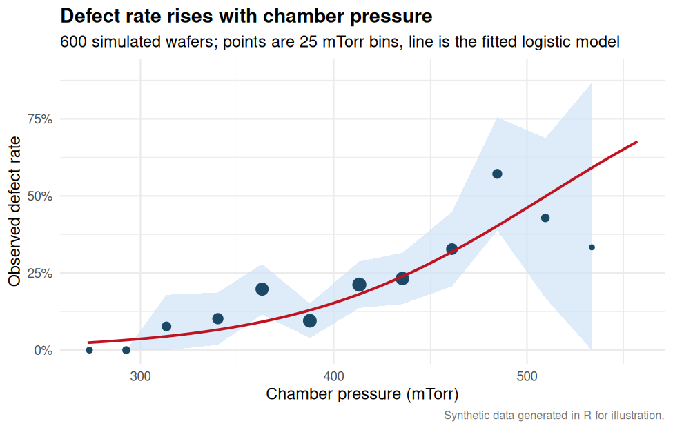
    Coefficients and confidence intervals say a relationship exists. They do not say the fitted shape is right. The check I reach for first is to bin the predictor and compare the observed defect rate against the model’s predicted rate within each bin.

    wafers$fitted <- fitted(fit)
    wafers$bin <- cut(wafers$pressure, seq(250, 550, by = 25))
    
    b <- aggregate(cbind(defect, fitted) ~ bin, wafers, mean)
    b$n <- aggregate(defect ~ bin, wafers, length)$defect
    
    print(cbind(bin = as.character(b$bin),
                observed  = round(b$defect, 3),
                predicted = round(b$fitted, 3),
                n = b$n), quote = FALSE)
    
    #       bin       observed predicted n
    #  (250,275]      0.000     0.018     4
    #  (275,300]      0.000     0.018     9
    #  (300,325]      0.077     0.072    26
    #  (325,350]      0.102     0.099    49
    #  (350,375]      0.198     0.136    91
    #  (375,400]      0.095     0.153   105
    #  (400,425]      0.212     0.202   113
    #  (425,450]      0.232     0.267    99
    #  (450,475]      0.328     0.330    58
    #  (475,500]      0.571     0.443    28
    #  (500,525]      0.429     0.440    14
    #  (525,550]      0.333     0.797     3

    The middle of the distribution tracks well. Between 300 and 475 mTorr the predicted rates sit close to the observed rates, and the overall trend is captured. The edges are noisier. The two lowest bins contain 4 and 9 wafers with no defects at all, and the highest bin contains 3 wafers, where the model predicts 0.797 and the observed rate is 0.333.

    The model overestimates defect risk in the sparse high pressure tail of this simulated dataset. With three wafers in that bin, the observed rate of 0.333 is not a stable estimate of anything. The honest conclusion is that the fit is reasonable through the bulk of the data and unreliable where the data runs thin. That is a property of the sample, not a failure of the method.
    Chamber pressure versus observed wafer defect rate with a fitted logistic regression curve, simulated data
    Binned observed defect rates against chamber pressure, with the fitted logistic curve and a 95% interval band. Synthetic data generated in R.

    Evaluating discrimination with a ROC curve

    A ROC curve shows how well the model ranks defective wafers above good ones as the threshold moves. The area under that curve is the probability that a randomly chosen defective wafer receives a higher predicted probability than a randomly chosen good one.

    phat <- fitted(fit)
    ord  <- order(phat, decreasing = TRUE)
    y    <- wafers$defect[ord]
    
    tpr <- cumsum(y) / sum(y)          # true positive rate
    fpr <- cumsum(1 - y) / sum(1 - y)  # false positive rate
    
    auc <- sum(diff(c(0, fpr, 1)) *
               (head(c(0, tpr, 1), -1) + tail(c(0, tpr, 1), -1)) / 2)
    auc
    # [1] 0.7841

    The area under the curve is 0.784. In plain terms, the model ranks a defective wafer above a good one roughly 78% of the time. I cross checked that figure against the Mann-Whitney U identity, which gives the same value, so the trapezoidal implementation is not the source of the number.

    ROC curve with AUC 0.784 for a two predictor logistic regression model of wafer defects
    ROC curve for the two predictor model. The dashed diagonal is random guessing. Synthetic data generated in R.

    An AUC of 0.78 is respectable for a two variable screening model on synthetic data, and it is not good enough to run a disposition decision from. It is good enough to rank a lot and send the worst wafers to inspection.

    The trap in a 0.5 cutoff

    The default behaviour of most classification code is to call anything above 0.5 a defect. On this dataset that produces a comfortably reassuring accuracy figure and a badly broken classifier.

    pred <- ifelse(phat > 0.5, 1, 0)
    tab  <- table(predicted = pred, observed = wafers$defect)
    tab
    #          observed
    # predicted   0   1
    #         0 454  99
    #         1  21  26
    
    mean(pred == wafers$defect)          # accuracy
    # [1] 0.8
    26 / sum(wafers$defect == 1)         # sensitivity
    # [1] 0.208
    454 / sum(wafers$defect == 0)        # specificity
    # [1] 0.9558

    Accuracy is 80%, which sounds like a working model. Sensitivity is 20.8%, which means it catches roughly one defective wafer in five and waves the other four through. The reason the two numbers coexist is the class imbalance. This dataset is 20.8% defective, so a model that predicts “no defect” for every single wafer already scores 79.2%.

    Always predicting no defect scores 79.2%. The fitted model at a 0.5 cutoff scores 80.0%. The cutoff adds less than one percentage point over doing nothing at all. High accuracy on an imbalanced outcome is close to meaningless on its own.

    The fix is to stop choosing the cutoff by convention and start choosing it by consequence. Sweeping the threshold makes the trade off visible.

    for (t in c(0.10, 0.15, 0.20, 0.25, 0.30)) {
      pred <- ifelse(phat > t, 1, 0)
      tb <- table(factor(pred, levels = c(0, 1)),
                  factor(wafers$defect, levels = c(0, 1)))
      cat(sprintf("%.2f  %.3f  %.3f  %3d  %.3f\n",
                  t, tb[2,2]/sum(tb[,2]), tb[1,1]/sum(tb[,1]),
                  sum(pred), tb[2,2]/sum(pred)))
    }
    Cutoff Sensitivity Specificity Wafers flagged Precision
    0.10 0.904 0.396 400 0.282
    0.15 0.848 0.558 316 0.335
    0.20 0.768 0.691 243 0.395
    0.25 0.632 0.794 177 0.446
    0.30 0.544 0.834 147 0.463

    The trade off is stark. Dropping the cutoff to 0.20 lifts sensitivity from 0.208 to 0.768, catches 96 of the 125 defective wafers, and flags 243 of 600 wafers, or about 41% of the lot. Precision at that setting is 0.395, meaning most flagged wafers are actually fine.

    No statistical criterion picks the right row in that table. The right cutoff is a cost decision. If a missed defect costs far more than an unnecessary inspection, move the cutoff down. If inspection capacity is the binding constraint, move it up. The model’s job is to produce a well ranked probability. Choosing where to cut is the engineer’s job.

    Checking whether the model holds together

    Two predictors, one degree of freedom each, and a deviance comparison is enough to confirm that both are contributing.

    c(null.deviance   = fit$null.deviance,
      resid.deviance  = fit$deviance,
      df.null         = fit$df.null,
      df.resid        = fit$df.residual)
    #  null.deviance resid.deviance        df.null       df.resid
    #        614.088        509.962        599.000        597.000
    
    fit$null.deviance - fit$deviance       # 104.126 on 2 df
    # p-value: <2e-16
    AIC(fit)                                # 515.96

    The fit reduces deviance by 104.1 on 2 degrees of freedom, which is far beyond what chance would produce. Both variables are pulling weight, and the AIC gives a baseline for comparing this model against alternatives you might build later.

    Two limits on that check are worth naming. Deviance based tests are approximate for binary outcomes, because the deviance does not follow a chi squared distribution as cleanly as it does for counts. A p value below 2e-16 here is a strong signal, not a precise measurement. And this model was never tested for an interaction between pressure and temperature offset. The true generating model in this simulation has no interaction, so a fitted interaction term would be capturing noise, but on real data that assumption needs to be tested rather than assumed.

    Where this fits in a process monitoring workflow

    Logistic regression is the natural companion to the continuous variable methods that already underpin process monitoring. Control charts answer whether a measured parameter has moved outside its expected variation, and I covered that ground in SPC charts in R for semiconductor process monitoring. Capability analysis answers whether the process can meet a specification once it is stable, which is the focus of the process capability analysis post.

    Both of those methods assume the thing you care about is a continuous measurement, such as film thickness or etch rate. Defect data breaks that assumption. Once the quality signal is binary, control charts and capability indices no longer apply in their usual form, and a model like this one takes over. It tells you which parameters move the odds of a defect, how strongly, and where to set a screening threshold.

    Practical notes before using this on real data

    Four things are worth carrying over from this exercise.

    Report the threshold sweep, not just the AUC. An AUC of 0.784 sounds fine, and the same model at a 0.5 cutoff catches one defect in five. The curve and the chosen operating point need to appear together.

    Keep the validation split honest. This model was evaluated on the data it was fitted to. Real defect models should be validated on held-out wafers, ideally split by lot or by time, because wafers from the same lot are not independent observations.

    Separate the odds ratio from the risk ratio. They track each other only when the outcome is rare. At a 21% defect rate they do not, and the gap grows as the rate climbs.

    Distinguish a significant coefficient from an accurate one. The pressure coefficient in this fit had a p value around 1.9e-10 and still landed 56% above the value used to generate the data. Statistical significance is a statement about signal relative to noise, not a guarantee of calibration.

    The complete analysis reproduces from the code shown with set.seed(2026). Swap in a real defect table with a binary outcome column and the same workflow applies. The parts that need rethinking for real data are the validation split, the threshold choice, and any interaction or wafer position terms the process actually has.
  • Process Capability Analysis (Cpk) in R for Semiconductor Manufacturing

    In semiconductor manufacturing, knowing that your process is in control is only half the picture. The real question is: can your process consistently produce material that meets the specification? A control chart tells you if the process is stable. A capability analysis tells you if that stable process is good enough.

    This post builds directly on our earlier tutorial on SPC Charts in R for Semiconductor Process Monitoring. If you have not read that post yet, it covers X-bar and R charts using the qcc package, and we will be using the same simulated LPCVD silicon nitride dataset here. You can also refer back to that post for an introduction to R if needed.

    What Process Capability Actually Measures

    Process capability compares the natural variation of your process against the specification limits defined by the product design. The key insight is that control limits and specification limits are two different things:

    • Control limits are statistically derived from your process data (±3 sigma from the process mean). They tell you whether the process is stable and predictable.
    • Specification limits are engineering requirements set by product design. They define what is acceptable for the customer.

    A process can be in statistical control (all points within control limits) but still incapable of meeting the specification if the natural variation is wider than the spec tolerance. This is exactly why capability analysis matters.

    The Capability Indices: Cp and Cpk

    Two indices form the backbone of capability analysis in manufacturing:

    Cp (Process Capability Index) measures the potential capability of the process assuming it is perfectly centered between the specification limits:

    Cp = (USL - LSL) / (6 * sigma)

    Cp tells you how many times the natural process variation (6 sigma) fits inside the spec tolerance. A Cp of 1.0 means the process variation exactly matches the spec width. A Cp of 1.33 means the spec width is 33% wider than the process variation, which is generally considered the minimum acceptable for a stable process. A Cp of 1.67 or higher is typical for critical parameters.

    Cpk (Process Capability Index, adjusted for centering) accounts for how centered the process is within the spec limits:

    Cpk = min( (USL - mean) / (3 * sigma), (mean - LSL) / (3 * sigma) )

    Cpk penalizes you for being off-center. A process can have a high Cp but a low Cpk if its mean has drifted closer to one spec limit. This is common in semiconductor manufacturing where processes often run slightly above target to ensure device performance, sacrificing some margin on the upper end.

    In practice, Cpk is the more useful metric because it reflects reality. A process can be capable on paper (high Cp) but still produce out-of-spec material if the mean is not centered (low Cpk).

    Capability Analysis in R with the qcc Package

    Using the same synthetic thickness data from the SPC post, we can run capability analysis with a single function call. The qcc package provides process.capability(), which takes a qcc object of type “xbar” and specification limits as inputs.

    Let us assume the engineering specification for our LPCVD silicon nitride film is 2000 ± 60 angstroms, which gives an LSL of 1940 and a USL of 2060:

    library(qcc)
    
    # Using the same xbar chart object from the SPC post
    set.seed(42)
    n_batches <- 25
    n_wafers <- 5
    thickness <- matrix(nrow = n_batches, ncol = n_wafers)
    
    for (i in 1:n_batches) {
      drift <- ifelse(i > 20, (i - 20) * 5, 0)
      thickness[i, ] <- round(rnorm(n_wafers, mean = 2000 + drift, sd = 15), 1)
    }
    
    batch_thickness <- as.data.frame(thickness)
    xbar_chart <- qcc(batch_thickness, type = "xbar")
    
    # Process capability analysis
    spec_limits <- c(1940, 2060)  # LSL, USL
    cap <- process.capability(xbar_chart, spec.limits = spec_limits)
    print(cap)

    Running the above code yields the following graph

    Image

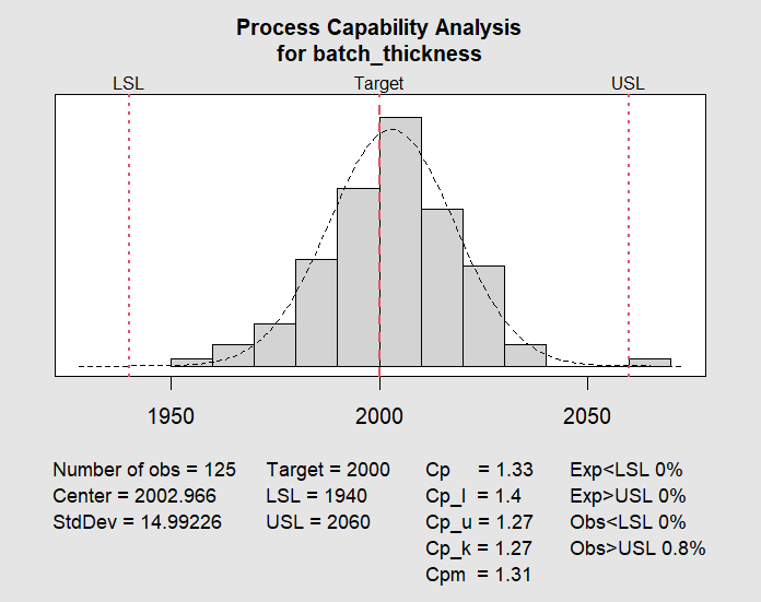
    The process.capability() function generates a histogram overlay showing the process distribution against the specification limits, with the capability indices printed. For our simulated data, the output will look something like:

    Process Capability Analysis
    
    $nobs
    [1] 125
    
    $center
    [1] 2002.966
    
    $std.dev
    [1] 14.99226
    
    $target
    [1] 2000
    
    $spec.limits
     LSL  USL 
    1940 2060 
    
    $indices
            Value     2.5%    97.5%
    Cp   1.334022 1.168084 1.499706
    Cp_l 1.399976 1.245746 1.554205
    Cp_u 1.268068 1.126833 1.409302
    Cp_k 1.268068 1.099776 1.436359
    Cpm  1.308651 1.143501 1.473546
    
    $exp
    Exp < LSL Exp > USL 
            0         0 
    
    $obs
    Obs < LSL Obs > USL 
        0.000     0.008

    We also get a histogram:

    Image

    A Cpk of 1.27 is below the commonly accepted threshold of 1.33, which makes sense because the drift in the final batches pulled the overall mean slightly upward and increased the overall variation estimate. This tells us that even though most individual measurements fall within spec, the process does not have enough margin to absorb the drift we observed.

    Interpreting the Results

    The capability output includes both short-term and long-term estimates. The qcc package reports based on the within-subgroup variation derived from the R chart, which represents the inherent short-term process capability. Key things to look for:

    • Cpk < 1.0: The process is not capable. Out-of-spec material will be produced regularly. Immediate action is needed to either reduce variation or shift the mean.
    • Cpk between 1.0 and 1.33: Marginal capability. The process can meet spec under ideal conditions, but any shift or increase in variation will produce defects. This is where most semiconductor processes operate for non-critical layers.
    • Cpk between 1.33 and 1.67: Capable process. The process has enough margin to absorb small shifts without producing defects. This is the target range for most critical parameters.
    • Cpk > 1.67: Highly capable. The process has significant margin. For ultra-critical parameters in advanced nodes, this level is often required.

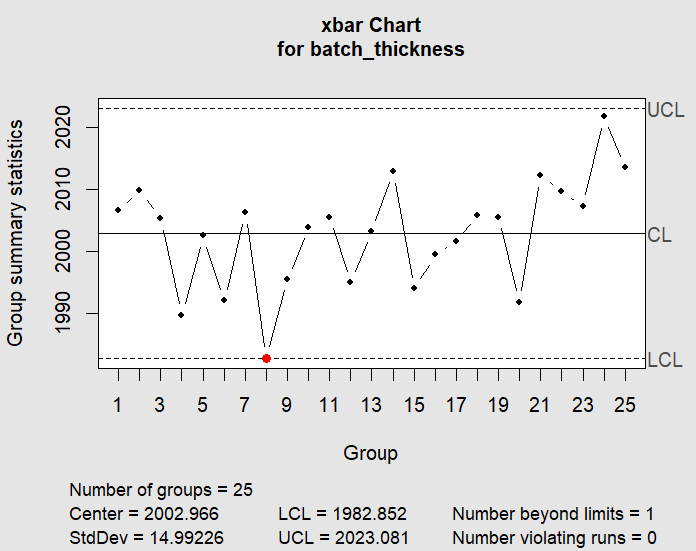
    In our example, a Cpk of 1.25 is marginal. The root cause is visible in the original X-bar chart: the upward drift in batches 21 through 25 shifted the overall mean and inflated the standard deviation estimate. Without that drift, the process would easily exceed a Cpk of 1.33. This illustrates why capability analysis and control charts should always be used together. The control chart identifies when and how the process shifted; the capability analysis quantifies the impact on yield.

    Pp and Ppk: Long-Term Capability

    The qcc package also reports Pp and Ppk, which use the overall standard deviation instead of the within-subgroup estimate. The distinction matters:

    • Cp and Cpk use within-subgroup variation (short-term). They represent what the process can achieve when it is stable and in control.
    • Pp and Ppk use the total standard deviation of all data points (long-term). They represent what the process actually delivered, including any shifts, drifts, and batch-to-batch variation.

    A large gap between Cpk and Ppk indicates that the process has significant between-subgroup variation or instability. In our example, the drift causes Ppk to be noticeably lower than Cpk, confirming that the process needs corrective action before capability can improve.

    Practical Considerations for Process Engineers

    A few things to keep in mind when applying capability analysis in a real fab environment:

    • Capability requires stability. Calculating Cpk on an out-of-control process is meaningless. Always check your control charts first.
    • Sample size matters. The qcc default of at least 20 subgroups is the minimum for a reasonable estimate. Fewer subgroups produce unreliable sigma estimates.
    • Specifications are not negotiable. If Cpk is low, the solution is to reduce variation or shift the mean, not to widen the specs. That said, understanding whether the spec is a true device requirement or a legacy limit can guide prioritization.
    • Cpk should be tracked over time. A single capability study is a snapshot. Tracking Cpk on a regular basis (weekly or monthly) reveals whether process improvements are actually working.
    • Non-normal data requires care. The qcc package assumes normality for capability calculations. If your parameter is not normally distributed (particle counts, defect densities), consider transformations or distribution-specific methods.

    What Comes Next

    With control charts and capability analysis in place, you have the two foundational tools for process monitoring. The next step is often extending this framework to handle multiple correlated parameters simultaneously, which is where multivariate SPC (Hotelling’s T²) comes in. We will cover that in a future post.

    For readers interested in quantifying process improvements more rigorously, our upcoming post on Propensity Score Matching for Pre/Post CIP Analysis will show how to apply causal inference methods to evaluate the real impact of chamber maintenance events.

    Conclusion

    Process capability analysis transforms control chart data into a clear, quantitative answer to the question every process engineer faces: can this process meet the specification? Using the qcc package in R, you can go from raw thickness measurements to a Cpk value and a capability histogram in just a few lines of code. The combination of control charts for stability and capability analysis for performance gives you a complete monitoring framework that works across deposition, etch, lithography, and any semiconductor process.

  • SPC Charts in R for Semiconductor Process Monitoring

    In semiconductor manufacturing, maintaining consistent process performance across wafers and across batches is critical for device performance. One of the most powerful tools for monitoring this consistency is the Statistical Process Control (SPC) Chart. In this tutorial, we walk through how to apply SPC charts in R to simulate thin film deposition data, covering X-bar and R charts, control limit calculations, and practical interpretation for process engineers.

    If you are new to R for data analysis, you may also find my earlier post on spreadsheets as a common programming tool a useful foundation before diving into statistical methods.

    Why SPC Matters in Process Monitoring

    Semiconductor manufacturing processes require tight control over critical parameters to ensure consistent device performance, yield, and reliability. Across processes such as deposition, etch, lithography, and thermal treatments, even small variations in factors like temperature, pressure, gas flow, or power can lead to measurable shifts in material properties and device characteristics. Statistical Process Control (SPC) provides a real-time method for detecting process drift early, enabling engineers to identify and correct deviations before they result in out-of-specification wafers or reduced manufacturing yield.

    Key SPC concepts for process monitoring include:

    • X-bar chart: Tracks the average value of a critical process parameter (such as film thickness, critical dimension, or electrical performance) across subgroups, such as wafers or lots, over time to monitor process stability.
    • R chart (range chart): Tracks the variability within each subgroup, helping identify changes in process consistency, uniformity, or equipment performance.
    • Control limits: Statistically derived boundaries (typically ±3 standard deviations from the process mean) that define the expected range of normal process variation, distinct from engineering specification limits.
    • Run rules: Additional statistical tests, such as multiple consecutive points above or below the center line, used to detect subtle trends, shifts, or non-random patterns before they become significant process issues.

    Generating Synthetic Thin Film Thickness Data

    For this walkthrough, we simulate thickness measurements from a hypothetical LPCVD silicon nitride process. This is a synthetic dataset created for illustrative purposes: we model 25 subgroups (batches) with 5 wafers each, a target thickness of approximately 2000 angstroms, and an intentional drift introduced in the final batches.

    The synthetic data uses a mean of 2000 angstroms with a standard deviation of 15 angstroms, with a +5 angstrom per batch drift added in the last 5 batches. This mimics a real-world scenario where a chamber component such as a heating element begins to degrade, causing a gradual upward shift in deposited thickness.

    We deliberately avoid claiming specific crystallographic orientations or substrate materials for this simulated data. The process environment is modeled as a generic polycrystalline thin film on a crystalline substrate, using peak intensity parameters consistent with typical nitride film characterization.

    Building X-bar and R Charts in R

    The R code below uses the qcc package, one of the most widely used libraries for SPC analysis. If you do not have it installed, run install.packages("qcc") first.

    
    # Load package
    library(qcc)
    
    # Generate synthetic thickness data (angstroms)
    set.seed(42)
    n_batches <- 25
    n_wafers <- 5
    thickness <- matrix(nrow = n_batches, ncol = n_wafers)
    
    for (i in 1:n_batches) {
      drift <- ifelse(i > 20, (i - 20) * 5, 0)
      thickness[i, ] <- round(rnorm(n_wafers, mean = 2000 + drift, sd = 15), 1)
    }
    
    # Create qcc objects
    batch_thickness <- as.data.frame(thickness)
    
    # X-bar chart
    xbar_chart <- qcc(batch_thickness, type = "xbar",
                      title = "X-bar Chart: LPCVD Film Thickness",
                      xlab = "Batch Number", ylab = "Mean Thickness (A)")
    
    # R chart
    r_chart <- qcc(batch_thickness, type = "R",
                   title = "R Chart: LPCVD Film Thickness Range",
                   xlab = "Batch Number", ylab = "Range (A)")
    

    Interpreting the Control Charts

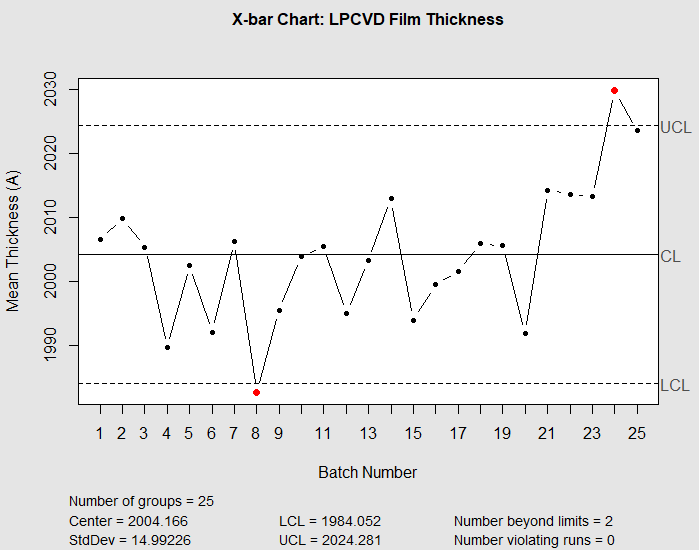
    When you run this code, the X-bar chart (shown below) will show all points within the upper and lower control limits for the first 20 batches. This indicates a stable, in-control process — exactly what a process engineer wants to see during routine production.

    Image

    Beginning around batch 21, the mean thickness will begin to climb above the center line. By batch 23, one or more points may fall above the upper control limit (UCL), signaling that the process has shifted. The R chart should remain stable throughout, indicating that the within-batch uniformity (wafer-to-wafer variation) has not changed — the problem is a shift in the mean, not an increase in variability.

    Applying Run Rules for Earlier Detection

    Standard control limits alone may not detect gradual drifts quickly enough. Run rules add sensitivity:

    • Rule 1: One point beyond the 3-sigma control limit.
    • Rule 2: Seven consecutive points on the same side of the center line.
    • Rule 3: Two out of three consecutive points beyond the 2-sigma warning limit.

    In our simulated data, the 7-point run rule (Rule 2) would flag the drift as early as batch 22, before any individual measurement exceeds the control limits. This is the practical value of SPC: catching problems before they produce out-of-spec material.

    R’s qcc package supports run rules via the rules argument. Adding rules = rulesets(c("rule1", "rule2", "rule3")) to the qcc() call will annotate violations directly on the chart.

    Practical Applications for Process Engineers

    SPC charts are not limited to thickness. They can be applied to any measurable property:

    • Refractive index from ellipsometry measurements across a wafer batch.
    • Film stress from wafer curvature measurements before and after deposition.
    • Sheet resistance for conductive thin films measured by four-point probe.
    • Uniformity calculated as (max – min) / (2 * mean) within a wafer.

    The same R code structure shown above works for any of these variables. Simply replace the thickness data with your measurement values and the control chart logic remains identical.

    Beyond Basic SPC: What Comes Next

    Once you have SPC charts running, the next step is often process capability analysis (Cpk), which compares the natural process variation to the specification limits. A Cpk value below 1.33 typically indicates that the process needs improvement. We will cover capability analysis in a future post.

    For readers interested in comparing multiple analytical approaches, our post on comparing logistic regression, SVMs, and random forests for classification demonstrates the kind of rigorous model comparison that complements SPC methodology in a broader data science toolkit.

    Conclusion

    SPC charts provide a straightforward, statistically grounded method for monitoring thin film deposition processes in real time. With just a few lines of R code using the qcc package, process engineers can detect drifts in mean thickness, identify changes in wafer-to-wafer variability, and trigger preventative maintenance before scrap material is produced. This blog uses a synthetic dataset to illustrate the workflow, but the same approach applies directly to real production data.

    The combination of X-bar charts, R charts, and run rules gives process engineers a practical early warning system. In future posts, we will extend this framework to multivariate SPC (Hotelling’s T-squared) and explore how control charts integrate with broader statistical methods such as Design of Experiments (DOE), which we will cover in a subsequent blog.