Tag: Data Analysis

  • Process Capability Analysis (Cpk) in R for Semiconductor Manufacturing

    In semiconductor manufacturing, knowing that your process is in control is only half the picture. The real question is: can your process consistently produce material that meets the specification? A control chart tells you if the process is stable. A capability analysis tells you if that stable process is good enough.

    This post builds directly on our earlier tutorial on SPC Charts in R for Semiconductor Process Monitoring. If you have not read that post yet, it covers X-bar and R charts using the qcc package, and we will be using the same simulated LPCVD silicon nitride dataset here. You can also refer back to that post for an introduction to R if needed.

    What Process Capability Actually Measures

    Process capability compares the natural variation of your process against the specification limits defined by the product design. The key insight is that control limits and specification limits are two different things:

    • Control limits are statistically derived from your process data (±3 sigma from the process mean). They tell you whether the process is stable and predictable.
    • Specification limits are engineering requirements set by product design. They define what is acceptable for the customer.

    A process can be in statistical control (all points within control limits) but still incapable of meeting the specification if the natural variation is wider than the spec tolerance. This is exactly why capability analysis matters.

    The Capability Indices: Cp and Cpk

    Two indices form the backbone of capability analysis in manufacturing:

    Cp (Process Capability Index) measures the potential capability of the process assuming it is perfectly centered between the specification limits:

    Cp = (USL - LSL) / (6 * sigma)

    Cp tells you how many times the natural process variation (6 sigma) fits inside the spec tolerance. A Cp of 1.0 means the process variation exactly matches the spec width. A Cp of 1.33 means the spec width is 33% wider than the process variation, which is generally considered the minimum acceptable for a stable process. A Cp of 1.67 or higher is typical for critical parameters.

    Cpk (Process Capability Index, adjusted for centering) accounts for how centered the process is within the spec limits:

    Cpk = min( (USL - mean) / (3 * sigma), (mean - LSL) / (3 * sigma) )

    Cpk penalizes you for being off-center. A process can have a high Cp but a low Cpk if its mean has drifted closer to one spec limit. This is common in semiconductor manufacturing where processes often run slightly above target to ensure device performance, sacrificing some margin on the upper end.

    In practice, Cpk is the more useful metric because it reflects reality. A process can be capable on paper (high Cp) but still produce out-of-spec material if the mean is not centered (low Cpk).

    Capability Analysis in R with the qcc Package

    Using the same synthetic thickness data from the SPC post, we can run capability analysis with a single function call. The qcc package provides process.capability(), which takes a qcc object of type “xbar” and specification limits as inputs.

    Let us assume the engineering specification for our LPCVD silicon nitride film is 2000 ± 60 angstroms, which gives an LSL of 1940 and a USL of 2060:

    library(qcc)
    
    # Using the same xbar chart object from the SPC post
    set.seed(42)
    n_batches <- 25
    n_wafers <- 5
    thickness <- matrix(nrow = n_batches, ncol = n_wafers)
    
    for (i in 1:n_batches) {
      drift <- ifelse(i > 20, (i - 20) * 5, 0)
      thickness[i, ] <- round(rnorm(n_wafers, mean = 2000 + drift, sd = 15), 1)
    }
    
    batch_thickness <- as.data.frame(thickness)
    xbar_chart <- qcc(batch_thickness, type = "xbar")
    
    # Process capability analysis
    spec_limits <- c(1940, 2060)  # LSL, USL
    cap <- process.capability(xbar_chart, spec.limits = spec_limits)
    print(cap)

    Running the above code yields the following graph

    Image

    The process.capability() function generates a histogram overlay showing the process distribution against the specification limits, with the capability indices printed. For our simulated data, the output will look something like:

    Process Capability Analysis
    
    $nobs
    [1] 125
    
    $center
    [1] 2002.966
    
    $std.dev
    [1] 14.99226
    
    $target
    [1] 2000
    
    $spec.limits
     LSL  USL 
    1940 2060 
    
    $indices
            Value     2.5%    97.5%
    Cp   1.334022 1.168084 1.499706
    Cp_l 1.399976 1.245746 1.554205
    Cp_u 1.268068 1.126833 1.409302
    Cp_k 1.268068 1.099776 1.436359
    Cpm  1.308651 1.143501 1.473546
    
    $exp
    Exp < LSL Exp > USL 
            0         0 
    
    $obs
    Obs < LSL Obs > USL 
        0.000     0.008

    We also get a histogram:

    Image

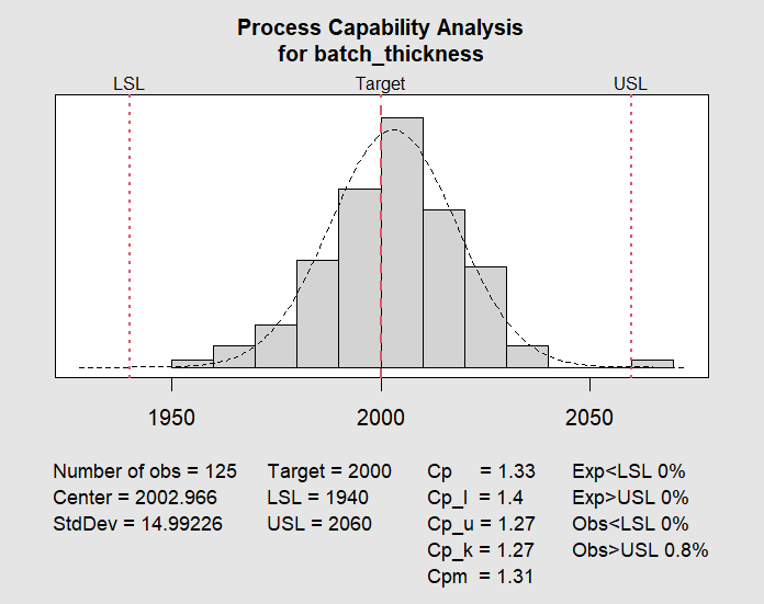
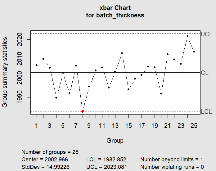
    A Cpk of 1.27 is below the commonly accepted threshold of 1.33, which makes sense because the drift in the final batches pulled the overall mean slightly upward and increased the overall variation estimate. This tells us that even though most individual measurements fall within spec, the process does not have enough margin to absorb the drift we observed.

    Interpreting the Results

    The capability output includes both short-term and long-term estimates. The qcc package reports based on the within-subgroup variation derived from the R chart, which represents the inherent short-term process capability. Key things to look for:

    • Cpk < 1.0: The process is not capable. Out-of-spec material will be produced regularly. Immediate action is needed to either reduce variation or shift the mean.
    • Cpk between 1.0 and 1.33: Marginal capability. The process can meet spec under ideal conditions, but any shift or increase in variation will produce defects. This is where most semiconductor processes operate for non-critical layers.
    • Cpk between 1.33 and 1.67: Capable process. The process has enough margin to absorb small shifts without producing defects. This is the target range for most critical parameters.
    • Cpk > 1.67: Highly capable. The process has significant margin. For ultra-critical parameters in advanced nodes, this level is often required.

    In our example, a Cpk of 1.25 is marginal. The root cause is visible in the original X-bar chart: the upward drift in batches 21 through 25 shifted the overall mean and inflated the standard deviation estimate. Without that drift, the process would easily exceed a Cpk of 1.33. This illustrates why capability analysis and control charts should always be used together. The control chart identifies when and how the process shifted; the capability analysis quantifies the impact on yield.

    Pp and Ppk: Long-Term Capability

    The qcc package also reports Pp and Ppk, which use the overall standard deviation instead of the within-subgroup estimate. The distinction matters:

    • Cp and Cpk use within-subgroup variation (short-term). They represent what the process can achieve when it is stable and in control.
    • Pp and Ppk use the total standard deviation of all data points (long-term). They represent what the process actually delivered, including any shifts, drifts, and batch-to-batch variation.

    A large gap between Cpk and Ppk indicates that the process has significant between-subgroup variation or instability. In our example, the drift causes Ppk to be noticeably lower than Cpk, confirming that the process needs corrective action before capability can improve.

    Practical Considerations for Process Engineers

    A few things to keep in mind when applying capability analysis in a real fab environment:

    • Capability requires stability. Calculating Cpk on an out-of-control process is meaningless. Always check your control charts first.
    • Sample size matters. The qcc default of at least 20 subgroups is the minimum for a reasonable estimate. Fewer subgroups produce unreliable sigma estimates.
    • Specifications are not negotiable. If Cpk is low, the solution is to reduce variation or shift the mean, not to widen the specs. That said, understanding whether the spec is a true device requirement or a legacy limit can guide prioritization.
    • Cpk should be tracked over time. A single capability study is a snapshot. Tracking Cpk on a regular basis (weekly or monthly) reveals whether process improvements are actually working.
    • Non-normal data requires care. The qcc package assumes normality for capability calculations. If your parameter is not normally distributed (particle counts, defect densities), consider transformations or distribution-specific methods.

    What Comes Next

    With control charts and capability analysis in place, you have the two foundational tools for process monitoring. The next step is often extending this framework to handle multiple correlated parameters simultaneously, which is where multivariate SPC (Hotelling’s T²) comes in. We will cover that in a future post.

    For readers interested in quantifying process improvements more rigorously, our upcoming post on Propensity Score Matching for Pre/Post CIP Analysis will show how to apply causal inference methods to evaluate the real impact of chamber maintenance events.

    Conclusion

    Process capability analysis transforms control chart data into a clear, quantitative answer to the question every process engineer faces: can this process meet the specification? Using the qcc package in R, you can go from raw thickness measurements to a Cpk value and a capability histogram in just a few lines of code. The combination of control charts for stability and capability analysis for performance gives you a complete monitoring framework that works across deposition, etch, lithography, and any semiconductor process.

  • Are US Police Trigger Happy?

    Recently, I stumbled upon a Washington Post article discussing the statistics of police-involved shootings and fatalities over recent years. The article referenced a comprehensive dataset, which I managed to download before encountering the paywall. This dataset documented all fatal police shootings spanning roughly a decade. While the data extended into 2024, I’ve excluded those entries from my analysis since the year is still ongoing.

    The dataset contained several key parameters:

    1. Date
    2. Name
    3. Age
    4. Gender
    5. Armed
    6. Race
    7. City
    8. State
    9. Flee
    10. Body Camera
    11. Signs of Mental Illness
    12. Police Departments Involved

    The dataset revealed a staggering 9893 cases – an alarmingly high number of individuals who lost their lives without due process, regardless of their alleged criminal activities. Each number represents a person denied their constitutional right to a fair trial.

    After examining the data quality and addressing missing values across various columns, I had to exclude approximately 400 entries, leaving me with 9509 cases for analysis. This sample size remains statistically significant enough to draw meaningful conclusions about the patterns present in the overall dataset.

    Demographics of the Victims

    My initial analysis focused on examining the age distribution of police shooting victims. The data showed a concentration in the 25-60 age range, which aligns with general crime statistics. This age group typically shows higher involvement in criminal activities or presence in high-crime areas.

    Agedistribution

    Further investigation revealed interesting patterns when analyzing racial demographics.

    The data initially appears to reflect expected proportions, given that White Americans comprise roughly 65-70% of the total population, explaining their higher representation among police shooting victims. However, a deeper analysis reveals concerning trends: Black and Hispanic victims show a notably skewed age distribution toward younger ages, with victims predominantly in their late teens and early twenties. In contrast, White victims follow a more normal distribution pattern, typically falling in their late twenties or thirties. This raises questions about whether social changes over the past few decades have led to increased police interactions with younger people of color. While this observation warrants further investigation, additional data would be needed to draw definitive conclusions about these demographic disparities.

    Age Distribution Based On Race

    While raw numbers provide one perspective, examining the percentage of population affected by police interactions offers deeper insights. I analyzed the Washington Post dataset in conjunction with US demographic data (sourced from here) to calculate these proportional impacts.

    Percentofvictimsbyrace

    In my analysis, I excluded the “Unknown” race category due to the discrepancy between census data accuracy and the Washington Post dataset’s limitations, likely stemming from incomplete police documentation. It’s worth noting that approximately 10% of victims in the original dataset had unspecified racial classifications.

    The proportional analysis reveals striking disparities: Native American and Black populations face double the likelihood of fatal police encounters compared to white populations. Hispanic individuals experience similar rates of fatal police interactions as white populations, while Asian Americans show half the likelihood of such encounters. The “Multiple Races” category contained insufficient data points for meaningful analysis, possibly due to inconsistent reporting in police records.

    One potential explanation for Asian Americans’ lower representation in police shooting statistics could be their generally reduced frequency of police interactions. While Asian Americans are widely recognized as one of America’s most successful immigrant groups, their family structure, as documented in Pew Research findings, might be a contributing factor. However, this remains a preliminary hypothesis requiring further investigation for definitive conclusions.

    Mental Health of the Victims

    My analysis then shifted to examining the mental health status of victims.

    The findings are concerning: approximately 2,000 victims over the past decade exhibited signs of mental illness. This suggests that redirecting resources toward mental health professionals and social workers might be more effective than relying solely on law enforcement.

    Mentalhealth

    Breaking down mental health data by race reveals another pattern: white victims of police shootings are roughly three times more likely to be classified as not mentally ill, while Black, Hispanic, and Native American victims show a five-to-one ratio between those classified as not mentally ill versus those showing signs of mental illness.

    Mentalinessbyrace

    It’s crucial to note that these mental health classifications are based on behavioral signs observed during police encounters, rather than professional diagnoses or established medical histories.

    Circumstantial Trends

    I focused on two key situational factors:

    1. Whether the victims were trying to flee?
    2. Whether the victims were armed?

    Were the Victims trying to Flee?

    Fleeing Behavior

    Analysis across racial demographics indicates that approximately half of the victims were not attempting to escape during their encounters with law enforcement. This suggests that many victims were likely complying with police directives, though definitive conclusions cannot be drawn solely from this dataset.

    Fleeingmode

    When examining the intersection of mental health status and escape attempts, a notable pattern emerges: the majority of mentally ill victims were not attempting to flee. This observation raises significant concerns about the necessity of lethal force in situations where alternative intervention methods might have been viable.

    The behavioral patterns of victims, when analyzed across different racial groups, demonstrate remarkable consistency. Where sufficient data exists, the distribution of victim responses appears uniform across racial categories, suggesting that behavioral responses to police encounters transcend racial boundaries.

    Fleeingbehaviorbyrace

    This consistency prompts a critical inquiry: In cases where victims showed no intention to escape, what circumstances prevented successful arrests without resorting to lethal force?

    Were the Victims armed?

    Analysis of weapon possession among victims reveals firearms as the predominant type of armament. However, a distinct pattern emerges among mentally ill victims within Native American and Hispanic communities, where knife possession was notably more prevalent.

    Werevictimsarmed

    This finding underscores the potential benefits of enhanced firearm regulation in protecting law enforcement officers – a measure that has faced consistent opposition from the National Rifle Association.

    How have Police Shootings trended over time?

    The past decade has witnessed a concerning upward trajectory in police-involved shootings and resultant fatalities. While a ten-year span might seem relatively brief in historical context, the data reveals a disturbing average of approximately 1,000 victims annually.

    Trendovertime

    The implementation of body-worn cameras appears to have limited impact, though it’s important to acknowledge potential delays between policy implementation and observable outcomes.

    Bodycamera

    Particularly concerning is the fact that body cameras were present in only one-third of documented cases.

    Bodycamwithrace

    When analyzing body camera usage across racial categories, while overall utilization shows an increasing trend, the data suggests a concerning pattern: incidents involving body cameras correlate with decreased likelihood of racial identification in victim documentation.

    Conclusion

    While numerous aspects of this issue warrant further investigation, certain data points remain unavailable – notably, comprehensive information about all police interactions, as this dataset exclusively covers fatal encounters.

    Nevertheless, the loss of 10,000 lives over a decade, through police shootings, represents an alarming figure, particularly considering that 20% of victims displayed signs of mental illness, and roughly half were not attempting to flee.

    This analysis, while revealing, highlights the need for more comprehensive research and complete datasets to fully understand and address these critical issues.

  • Spreadsheets: Common man’s programming tool

    #include <stdio.h>
    
    int main() {
        printf("Hello, World!\n");
        return 0;
    }

    I remember sitting in my computer science class about two decades ago and my teacher teaching us how to print “Hello World”. I never became a computer scientist – nor did I become a professional programmer. But I did come to appreciate how useful programming is for most professions.

    As an experimental Materials Scientist, I use programming so often to manipulate data, to analyze data, to predict the best possible set of experiments to run – and all the while I often wonder, why the common student is taught the dry programming of Hello World, that comes with C or C++ or Python or any of the other programming languages that exist, and why students are not introduced to the power of spreadsheets. Don’t get me wrong, I don’t undermine the value of true programming languages, but in my mind, =SUM(A1:A45) has more value than printf("Hello, World!\n"); as they offer a more practical entry point. Spreadsheets may not be sexy, but for most, they’re the perfect tool – since they can reduce errors, increase automation thereby, saving time.

    Here are a few good reasons why I feel spreadsheets are quite important:

    1. Low barrier to Entry
    2. Democratization of data
    3. WYSIWYG
    4. Teaching the fundamentals of programming

    And once someone graduates past the basic spreadsheet like Microsoft Excel, then they can even access VBA (a built-in programming language within excel) or Google Apps Script (a built in programming language within Google Sheets) to enable more complex functionalities.

    Spreadsheets offer a powerful and versatile toolset for anyone who works with data. Their low barrier to entry makes them accessible, while features like formulas and conditional formatting automate tasks, saving time and reducing errors. But spreadsheets hold a hidden gem: VBA in Excel and Apps Script in Google Sheets. These built-in programming languages unlock a whole new level of automation and functionality. Imagine automating complex data analysis, generating reports with a single click, or creating custom functions tailored to your specific needs.

    The next time you find yourself drowning in data, don’t underestimate the power of your spreadsheet. With a little exploration and the help of readily available online resources, you can unlock the hidden potential of VBA or Apps Script and transform your workflow. So, ditch the “Hello World” and dive into the world of spreadsheet programming – the possibilities are endless!